DELFT CAMPUS

development of a branding system for a new urban area

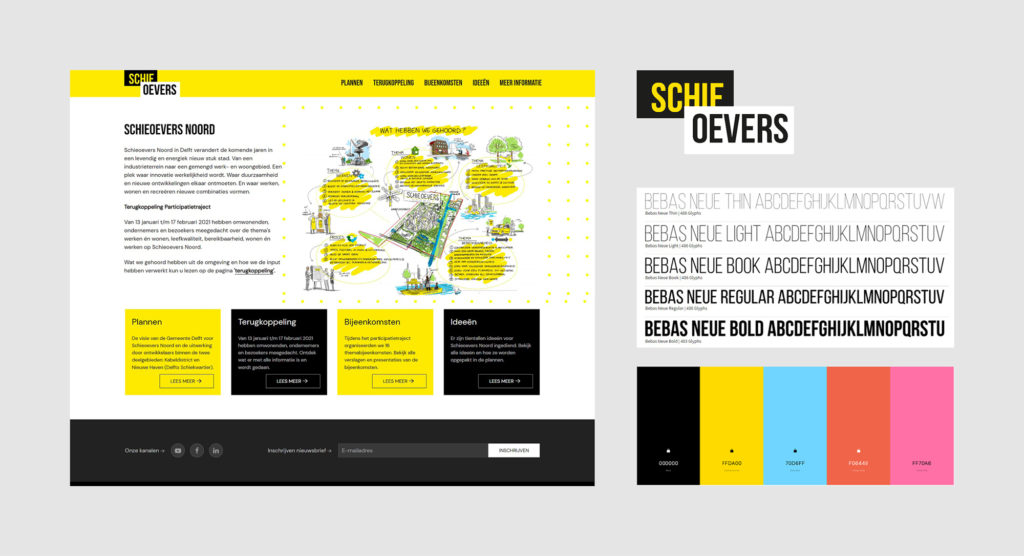
In June 2022 I was asked by Sicko from Studio Claro to join a project that they were working on – a branding system for Delft Campus, a new living, working and recreational area in the city of Delft.


The idea was to create different elements that would communicate to Delft citizens about the space that is being created. The works in the area have just started and the Municipality of Delft wants to invite the citizens to share the ideas about how the place could be designed to meet different needs of its future users.


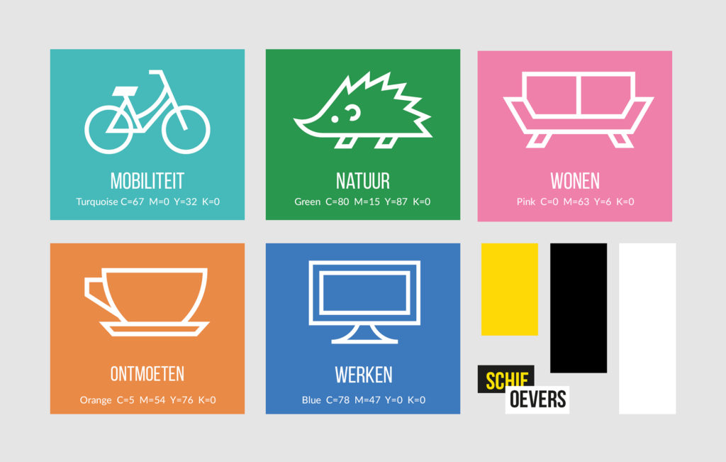
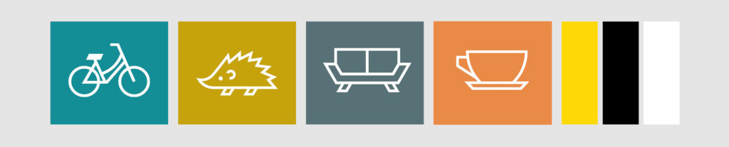
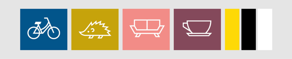
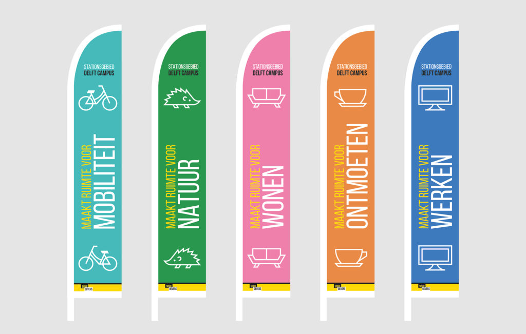
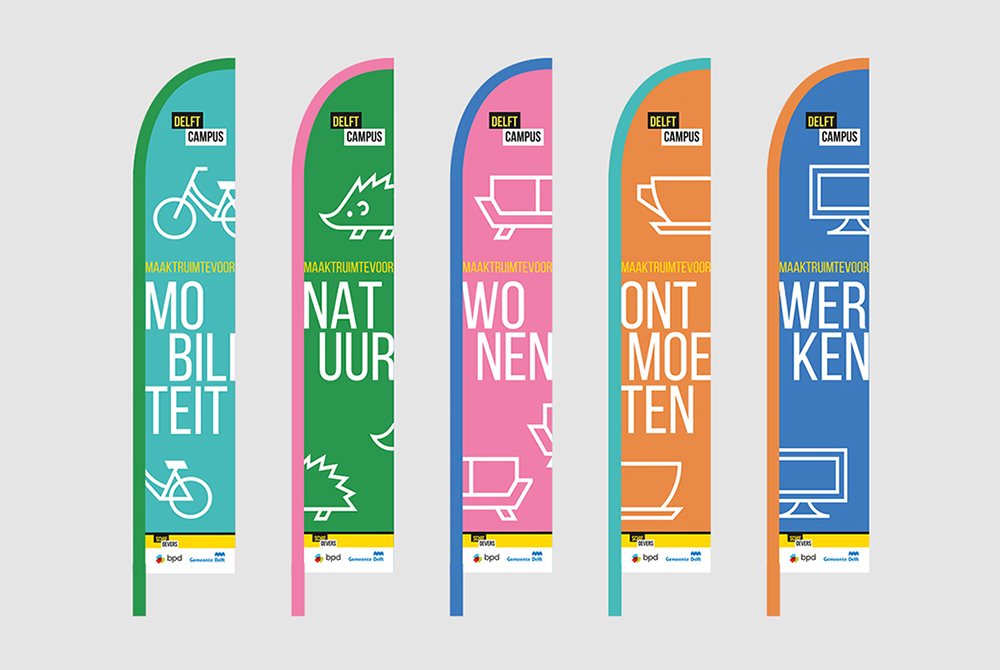
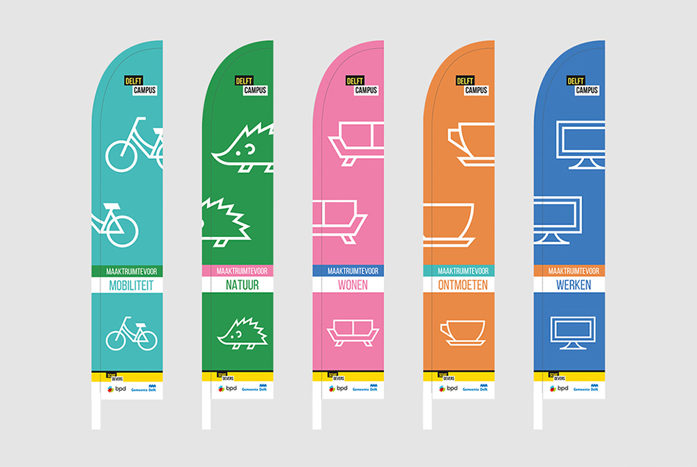
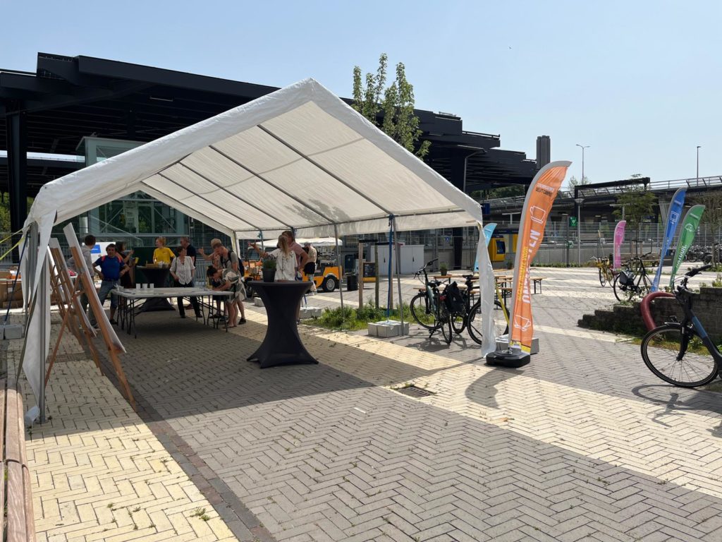
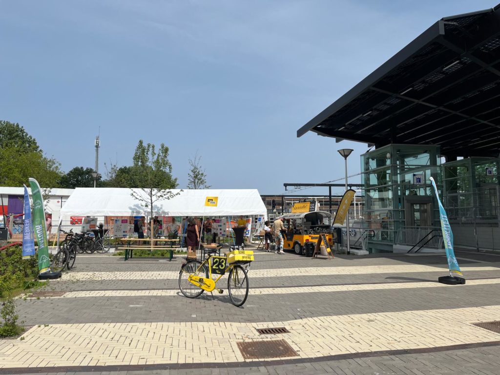
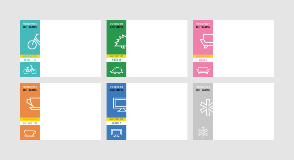
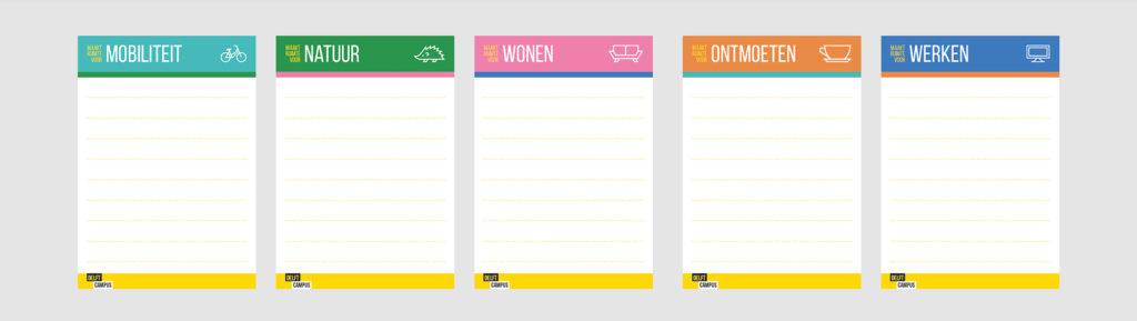
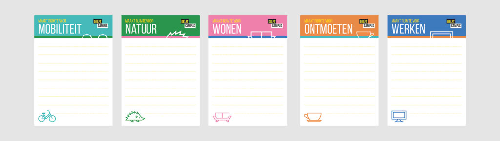
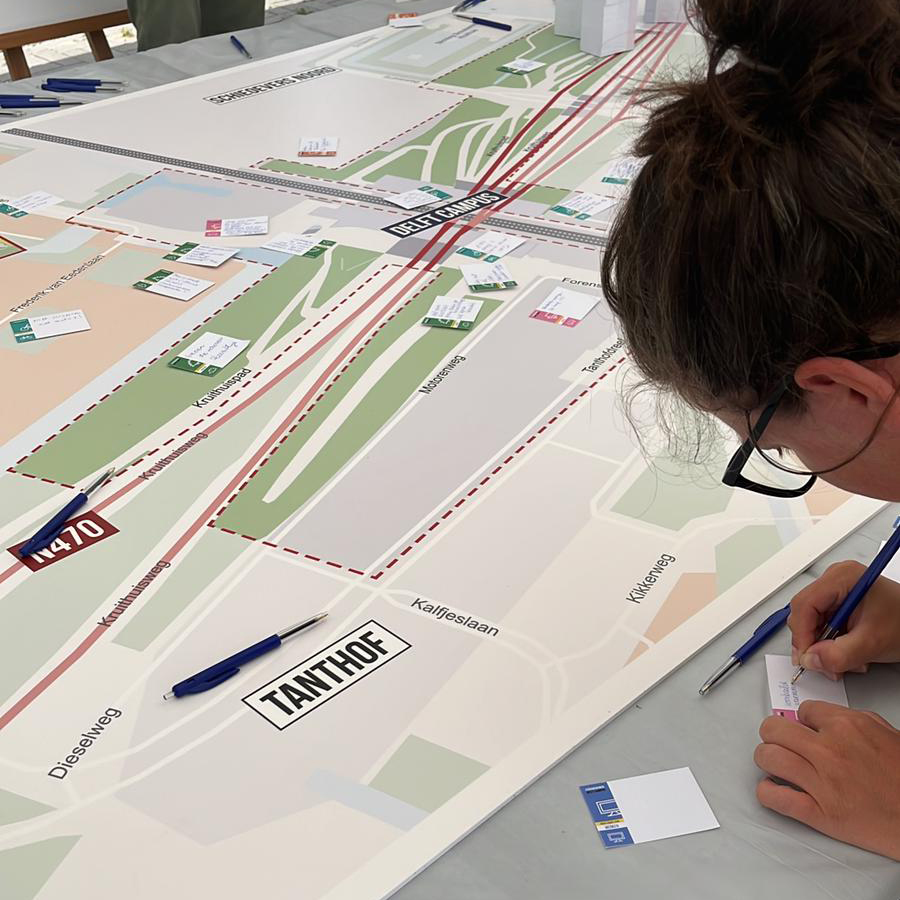
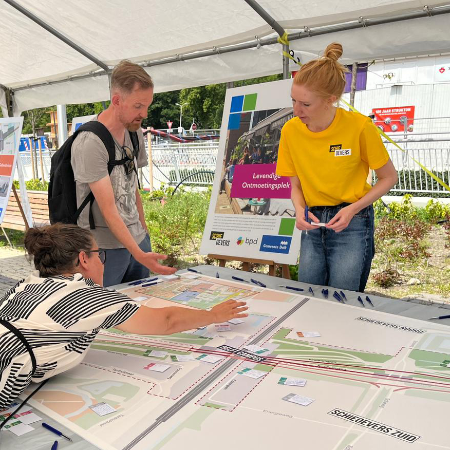
One of the first events with the Delft dwellers was the ‘FietsSafari’ during which the participants could get familiar with the five main aspects of life that the place should facilitate (mobility, nature, living, meeting with others, working) and write down their suggestions. For that event we needed to design beach flags and small comment cards; to keep the communication clear and understandable, we started from designing the colour and sign language for the whole project.

project management

Studio Claro


graphic design

Studio Claro / Sicko van Dijk
juka design / Julia Karwasz


final client

Municipality of Delf

BPD (Bouwfonds Property Development)

starting point

Delft Campus is a part of larger area, called Schieoevers Noord. That part of the city has been in a process of revitalisation since 2021 and had already some elements of branding: a logo, leading colours (yellow, black and white), font (Bebas Neue) and a website. The new Delft Campus communication had to keep the basic colour palette of Schieoevers but expand it a bit to cover more topics. Sicko created a new lively colour palette and invited me to work on it further and propose another options.

Colour palette & icons

As the Delft Campus communication was going to focus on five topics (mobility, nature, living, meeting with others, working — in Dutch: mobiliteit, natuur, wonen, ontmoeten and werken), I decided to assign a colour for each of the themes and compose it with the three Schieoevers colours. After considering two other proposals of the colour palette, the final client decided to use the most vibrant one. 


I also created a set of icon representing each topic. I chose a simple linear style with sharp edges, to keep it in line with Schieoevers logo and font.


Alternative colour palette proposals.

Flags

The flags used at the FietsSafari event were ment to communicate clearly about the five aspects of the new area. After considering various alternative versions, the most readable one was created, with the full icons and possibly big text.

Alternative flags design proposals.

Flags used during the ‘FietsSafari’ event.

comment cards

Comment cards were designed to give the citizens of Delft a chance to share their ideas on each of the five main themes. We have also designed a sixth card for general comments.


During the FietsSafari the participants were invited to fill in the cards and place them on the map, corresponding to the places where the innovations could be made.

Alternative design proposals for the comment cards.

Comment cards in use.