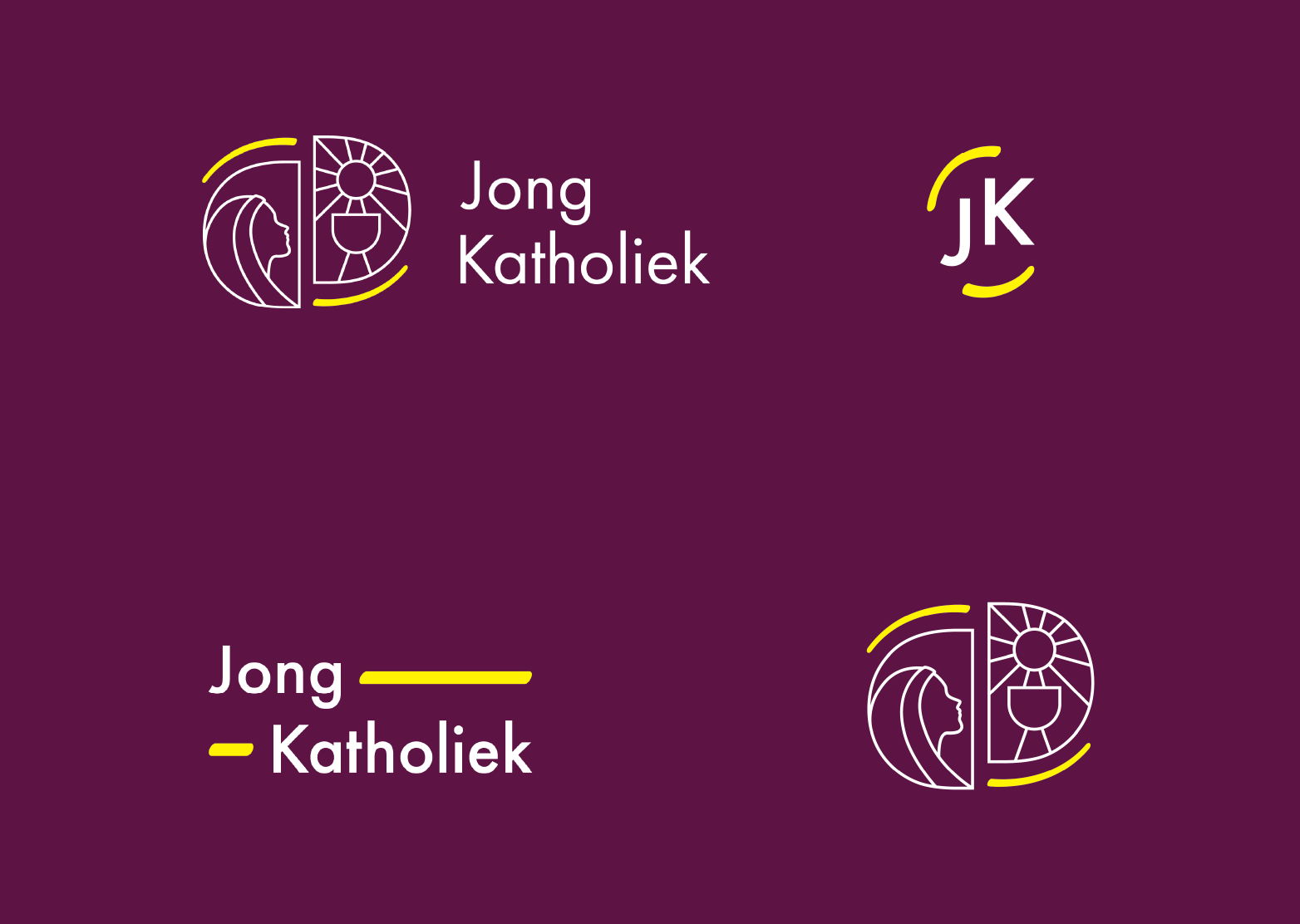
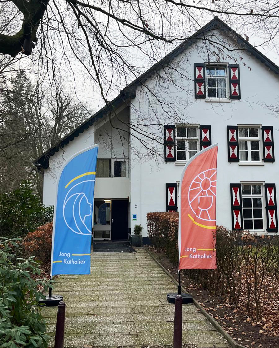
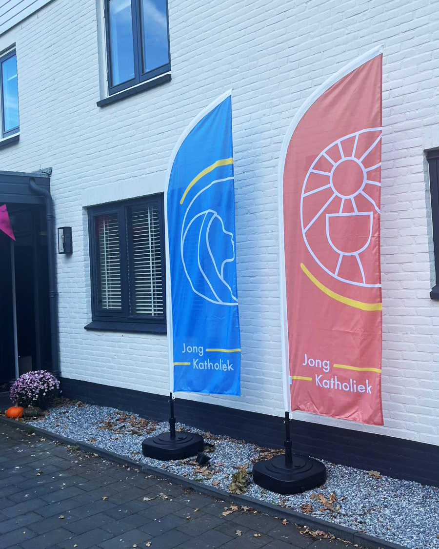
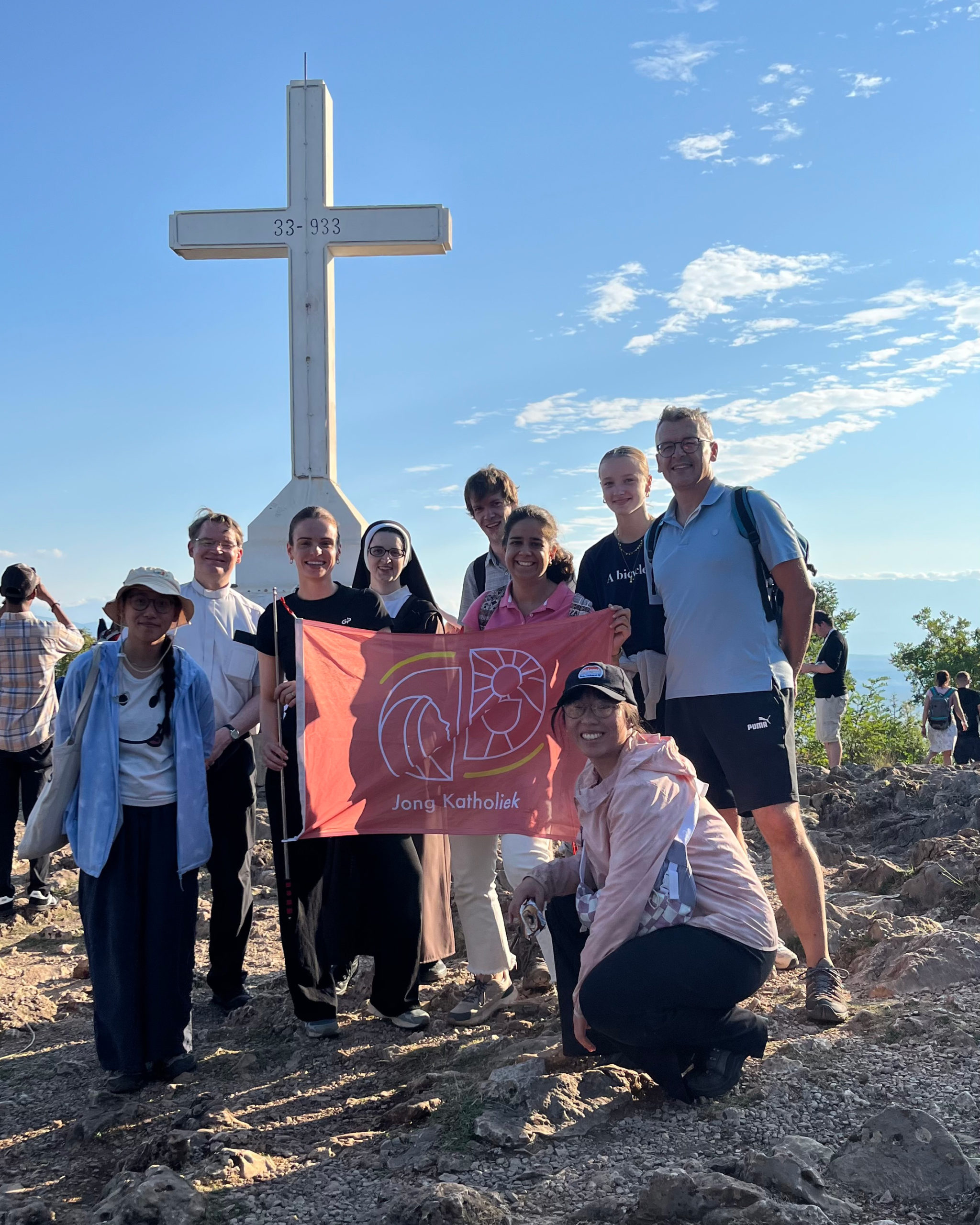
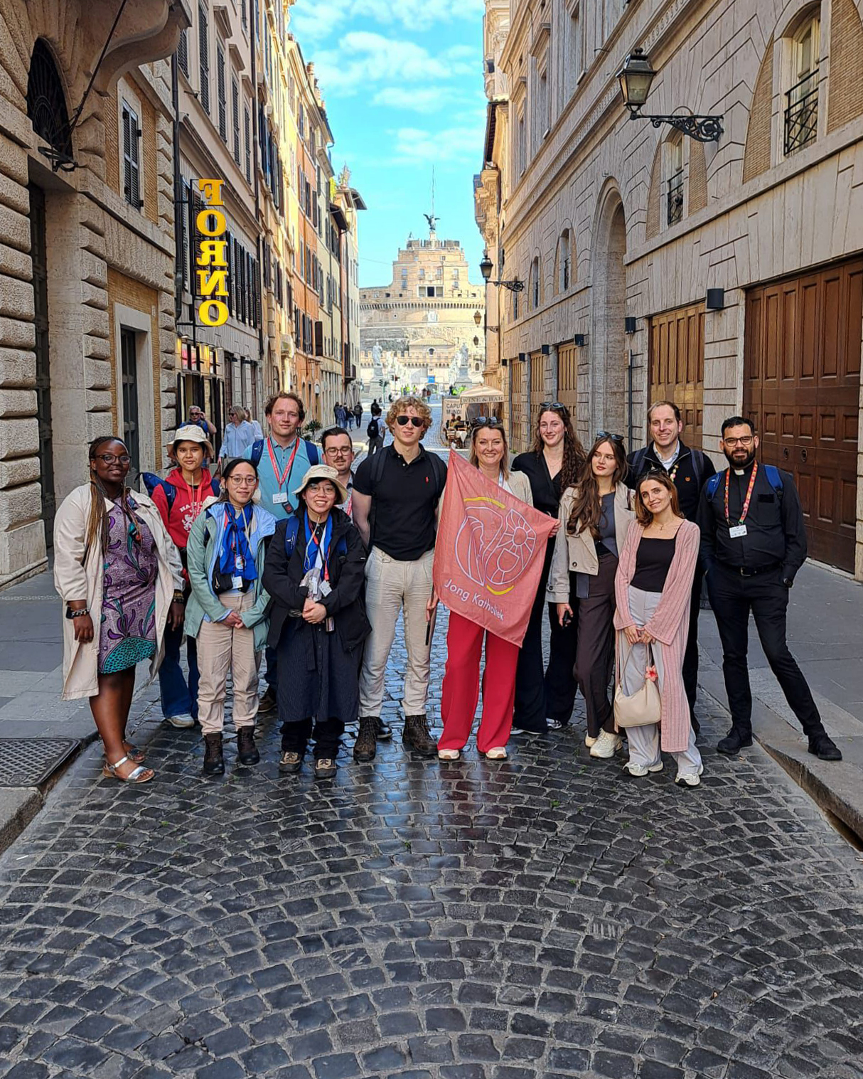
logo suite
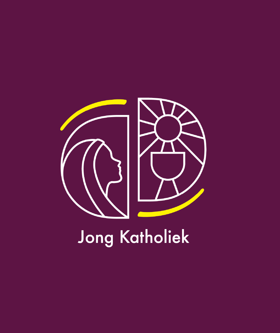
The most challenging part was creating the logo. It was meant to carry a complex message while still looking clean and scalable, as a proper logo should.
The logo mark presents the idea of the Church that Don Bosco, the patron saint of youth, saw in his vision: the Eucharist and Holy Mary as the two essential pillars. The yellow strokes show how these two pillars work together, just as the Dutch bishoprics work together to build unity in the Church. Bright yellow also stands for movement, dynamism, and youth.
The primary logo consists of the logo mark and a smaller logotype beneath it. The logo mark can also be used on its own. For greater adaptability, I also created a horizontal version of the logo, as well as a more typographic variant and a simple lettermark for more subtle branding solutions.