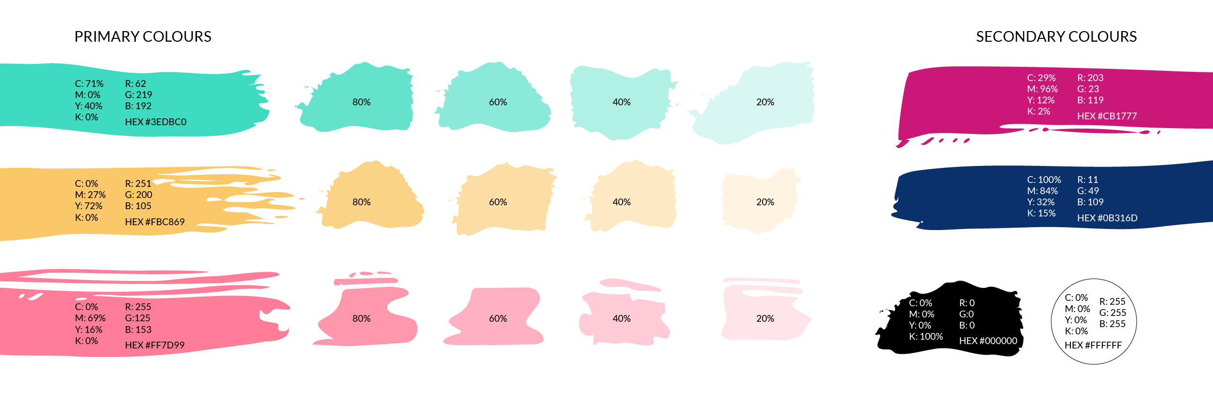
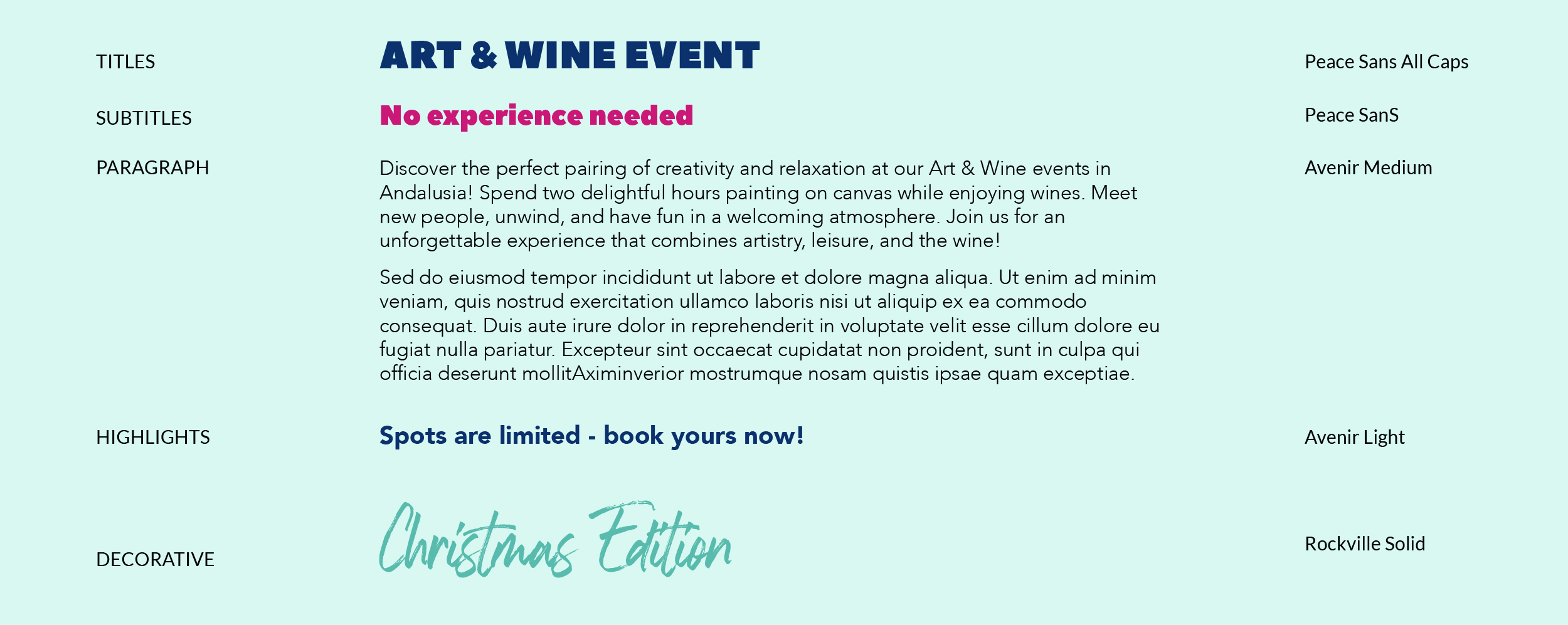
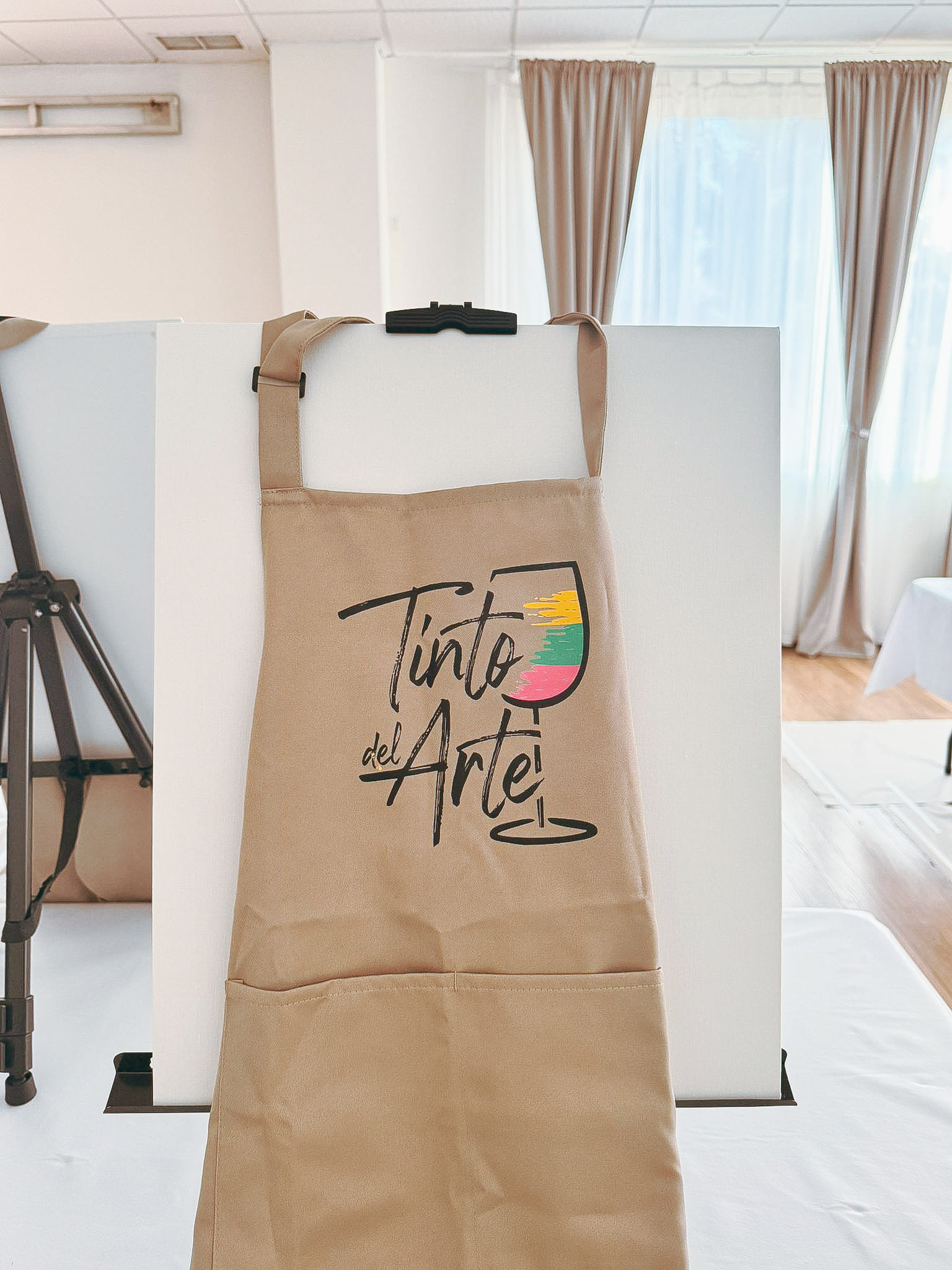
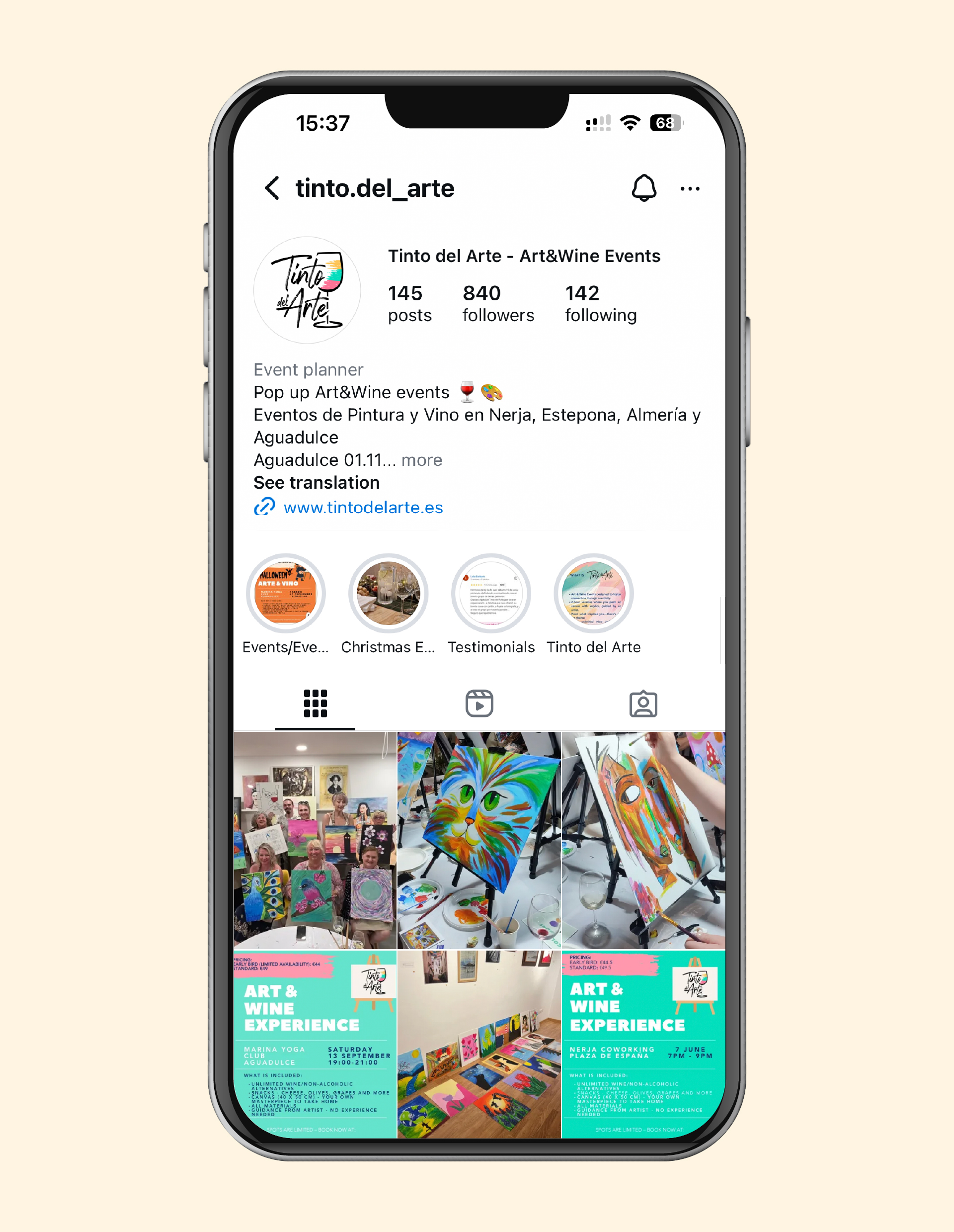
In 2024 I had a pleasure to work on visual identity of Tinto del Arte – company which brings Art & Wine events to sunny Andalusia. Agata, the founder, wanted the brand to look playful, colourful and classy. Together we created a vibrant look that she could later apply on her website, social media and printed goods.

logo suite

The brief was to include a visual clearly pointing on wine and painting.
The flexible logo suite—featuring vertical, horizontal, and standalone mark variations—ensures versatility across different applications, from event materials to social media.

Colour palette

We chose bold, contrasting colours and added lighter tints to keep everything flexible and easy to use across different materials.

typography

The typography combines clean, modern sans-serifs with a more expressive script to reflect both structure and creativity. Bold, all-caps titles help grab attention, while lighter text keeps longer content easy to read and approachable. 

how it works

This is how the visual identity works applied on aprons and in social media.